March 30th, 2026
Attik Update - Login with Google, Reports Hub Upgrades, Payment Improvements & Mobile App Updates
Summary
Sign into Attik using your company Google email
Reports Hub now supports richer report building with linked data, stronger previewing, improved sharing behavior, and prebuilt report paths.
Teams can now view equipment details more clearly in events and workorders.
Invoice and payment workflows picked up meaningful upgrades, including better refund handling and selective invoice charge display.
Scheduling and reschedule flows were improved, including fixes around cancelled/rebook workflows.
Multiple updates to the mobile app to enhance inspector experience.
New Features
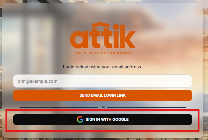
Sign in with Google on the login screen
What changed: The Attik login page now allows for login using the Sign in with Google button. Choosing it starts sign-in with Google and, when successful, takes you into Attik the same way a completed email link sign-in would.
Before: Sign-in was centered on other methods (such as getting a login link by email), depending on how your instance was set up. There was no Google button on the login screen for this flow.
Now: Where Google sign-in is enabled, you’ll see Sign in with Google on the login screen and can use your Google email and password (or Google’s own prompts, such as passkeys or two-step verification) to authenticate.

Why it matters: Fewer steps and less password juggling for people who live in Google Workspace; clearer option for “I use my company Google account” without hunting for the right email link. Admins still control which sign-in methods are available for your organization.
Expanded Reports Hub Builder and AI Assistance
What changed: The Reports Hub was expanded with richer report-building controls, including linked collection support, stronger filter/aggregation options, prebuilt runs, and in-flow AI help.
Before: Teams had more limited report composition and had to rely on narrower report setup patterns.
Now: Teams can build more advanced reports in one flow and use AI-assisted guidance while creating reports.

Why it matters: This makes custom reporting more practical for operations, implementation, and leadership teams without relying on ad-hoc spreadsheets.
Equipment Visibility in Events and Workorders
What changed: Equipment requirements are now surfaced more directly in event and inspection workorder experiences.
Before: Teams had to infer or cross-check equipment needs from other places.
Now: Equipment requirements appear in the scheduling/workorder flow where teams are actively making dispatch decisions.

Why it matters: This reduces missed equipment prep and helps field coordination stay accurate.
Contact usage tiers and job-volume insights
What changed: You can define usage tiers for each contact role (such as agent, client, or other roles your company uses). Each tier has a name, a range of job counts (based on recent work), and a color. Attik then calculates how many jobs each person has in that role over the last three, six, and twelve months, assigns the matching tier, and shows whether their twelve‑month volume is trending up, down, or steady compared with the year before. That tier, trend, and count context appears next to people on the contact directory, on quotes, and on workorders and inspections—wherever those people are already listed.
Before: Seeing who your heavy repeat relationships were meant digging through history or external habits; there was no standard, at-a-glance signal tied to role and recent job volume in the places staff already work.
Now: The same person can be summarized differently by role, with color‑coded tiers your office defines and simple trend direction for the last year vs. the prior year—right beside their name when scheduling, quoting, or managing the job.

Why it matters: Brands can prioritize outreach, recognize top referrers or high‑volume agents, and notice cooling or growing relationships without running a separate analysis—while keeping the definitions aligned with how your company actually labels roles.
Requested jobs stand out on schedule and inspection (Mobile App)
What changed: When a job lists you among requested inspectors, the mobile app shows a clear indicator (a star on schedule cards and matching treatment on the inspection details screen).
Before: There was no in-app signal that you were specifically requested for that job.
Now: You can spot requested work alongside your usual schedule and inspection details.
Why it matters: You can prioritize the right jobs without digging through office notes or the web app.
View all notes from the inspection screen (Mobile App)
What changed: The notes area on an inspection includes a View All Notes control that takes you to the full notes experience for that job.
Before: You saw grouped notes on the inspection screen without a dedicated path to the complete list in one tap.
Now: One tap opens everything for that inspection’s notes.
Why it matters: Long threads and older notes are easier to reach when you are in the field.
Finish report work from the inspection screen in (Mobile App)
What changed: On a job’s inspection screen in Attik Mobile, there is now a Reports area that matches how you wrap up reporting in the office: you can see what’s still needed for each service, add or link reports, update status (including marking a report Completed), refresh reports when your report system has new drafts, and open a report or the work order in Attik when you need the full Attik experience in the browser. View in Attik also lists client portal links by contact when those apply, so you can jump out and back without redoing your place in the app.
Before: Inspectors could review job context on the phone but still had to leave the app for most of the end-of-job reporting and wrap-up steps.
Now: The core reporting and completion steps for an inspection live on the inspection screen, with clear ways to open Attik or the portal in the browser only when something still has to happen there.
Why it matters: Less juggling between the field app and a laptop, faster handoff after the site visit, and fewer “I’ll finish that when I’m back at the desk” gaps.
Improvements
Payment and Refund Workflow Accuracy
What changed: Refund and batch-related calculations were improved, including fee-aware refund handling.
Before: Partial and edge-case refund handling could lead to confusing totals or extra reconciliation effort.
Now: Refund behavior and related payment totals are more consistent across payment views.

Why it matters: This improves trust in payment records and saves time during reconciliation.
Unfinished payment and agreements show up open on the job page
What changed: On the client portal job view, sections that still need the client’s attention—such as agreements that need a signature or payment that is not complete—now open automatically when the client is allowed to see them, together with Reports when reports are available. Finished steps stay collapsed so the page stays easy to scan.
Before: Important steps could stay folded closed even when payment was still due or agreements still needed action, so clients sometimes overlooked them.
Now: The work that still needs doing opens up front, so clients see sign and pay tasks without digging through collapsed sections.

Why it matters: Fewer missed signatures and payments, and less back-and-forth for your team when clients “didn’t see” what to do next.
Softer AI answers for general report questions
What changed: When someone asks the report AI assistant a very general question, responses lean on a lighter knowledge style instead of over-asserting inspection-specific facts.
Before: General questions could get answers that felt too specific or off-topic for what was asked.
Now: Replies better match the intent of broad questions while staying helpful.
Why it matters: The assistant feels more natural for quick questions without misleading readers about the inspection.
Contact details when you expand a row (Mobile App)
What changed: Expanding someone in the contacts list shows their phone number (formatted for readability) and email address above the Call, Message, and Email actions.
Before: You had action buttons but did not see the raw phone and email spelled out in the expanded section.
Now: You can confirm the number or address before you tap to reach out.
Why it matters: Fewer misdials and less guessing when several people share a role on a job.
Sign-in codes survive switching away from the app (Mobile App)
What changed: If you step away to your texts, email, or another app while signing in, the app remembers that you are mid–sign-in code flow for a short window and brings you back appropriately when you return.
Before: Backgrounding the app could force you to restart sign-in from the beginning.
Now: You can complete verification without repeating earlier steps, within the allowed time.
Why it matters: Sign-in is less frustrating on real devices where people constantly switch apps.
Schedule cards and location transparency (Mobile App - iOS)
What changed: Schedule cards use more consistent layout and styling so times and status read more cleanly. On iPhone, when the system asks for location access, the explanation text now describes using location for map placement and directions to inspection sites.
Before: Cards were slightly less consistent visually; the location permission prompt used generic or missing explanation text.
Now: The schedule is easier to scan, and the location prompt matches how the app uses location.
Why it matters: Less visual noise on a busy day, and clearer trust when the device asks for location.
Requested inspector indicator (Mobile App)
What changed: When an inspector is marked as requested on a job, that shows as a badge on the inspection screen and on schedule cards.
Before: Requested assignments were easier to miss on mobile.
Now: Requested work stands out in the schedule and inspection header area.
Why it matters: Dispatch and inspectors align on who was asked for without opening extra screens.
Notes list and “view all” (Mobile App)
What changed: Notes on an inspection are easier to browse, with streamlined filtering and a clear way to open the full notes list.
Before: Long note threads were harder to scan or open in full.
Now: You can jump to everything when you need the full history.
Why it matters: Office and field staff catch up on job context quickly from the phone.
Bug Fixes
Cancelled/Rebook Workflow Reliability
What changed: Workorder and contact flows were updated so cancelled jobs can be found and rebooked more reliably.
Before: Rebooking cancelled work could be inconsistent and required extra manual checks.
Now: Cancelled-to-rebook workflows behave more predictably in day-to-day operations.
Why it matters: This reduces lost opportunities and scheduling errors when customers need to book again.
Event Sync Duplication and Loop Protection
What changed: Sync handling was tightened to avoid processing paths that can create duplicate or unlinked event behavior.
Before: Some sync patterns could create messy event states that needed cleanup.
Now: Event sync behavior is more guarded in standalone synchronization scenarios.
Why it matters: Teams spend less time cleaning calendars and resolving avoidable scheduling confusion.
Large-Home Booking Validation Consistency
What changed: Booking validation and related route handling were improved around edge-case square-footage behavior.
Before: Some large-home scenarios could hit inconsistent behavior across booking paths.
Now: Booking validation behavior is more consistent for those edge cases.
Why it matters: This reduces avoidable booking interruptions for high-value jobs.
Client inspection report reading experience
What changed: When clients open an inspection report online, photo captions show more reliably, summary view still lets you open full finding details when needed, and media rows show clearer photo versus video counts. The optional AI help panel for reports clears when you close it and avoids showing outdated streamed text.
Before: Captions could appear inconsistently, summary mode could hide important detail, media counts were less obvious, and the AI help panel could feel “stuck” on old content after closing.
Now: The report is easier to scan, summary reading is less limiting, media is easier to interpret at a glance, and AI help feels cleaner to open and close.
Why it matters: Clients and agents review reports faster and with less confusion during walkthroughs and negotiations.
Time clarity on jobs and agreements
What changed: Time and date handling was improved where jobs and agreements are shown and edited so local timing is less ambiguous.
Before: Timezone-related edge cases could make scheduled times or agreement timing harder to trust at a glance.
Now: Display and handling better respect the intended local context.
Why it matters: Fewer scheduling misunderstandings and cleaner agreement timing for staff and customers.
Sign-in codes survive switching apps (Mobile App)
What changed: Email or text sign-in verification keeps your place in the flow if you leave the app and return (for example to read a code in mail or messages).
Before: Backgrounding the app could interrupt verification and force you to start over.
Now: You can complete verification after switching apps.
Why it matters: Less frustration signing in on a phone during a busy day.